Color is a powerful tool in commercial interior design that can significantly impact the mood, perception, and behavior of individuals within a space. From calming blues to vibrant reds, each color has its own psychological associations and can evoke different emotions and reactions. Understanding the psychology of colors is crucial for creating impactful and visually appealing spaces that align with the brand’s identity and purpose. In this article, we will delve into the psychology of colors in commercial interior design and how a commercial interior design company can expertly leverage color palettes to create engaging and harmonious environments.
The Influence of Color on Emotions
Colors have the ability to evoke a wide range of emotions and moods. Warm colors like red, orange, and yellow tend to create a sense of energy, excitement, and warmth. Cool colors such as blue, green, and purple evoke feelings of calmness, relaxation, and serenity. Neutrals like white, beige, and gray are often associated with simplicity, sophistication, and balance. Understanding these emotional associations allows designers to strategically select colors that evoke the desired mood and ambiance within a commercial space.
Establishing Brand Identity with Colors
Colors play a crucial role in expressing a brand’s identity and purpose. By incorporating brand colors into the interior design, businesses can reinforce their brand image and create a cohesive visual experience. Each color carries its own connotations and symbolism, and a commercial interior design company can help select colors that align with the brand’s values, target audience, and industry. From vibrant and playful to professional and elegant, the color palette sets the tone for the entire space.
Creating a Welcoming Reception Area
The reception area is the first point of contact for visitors and sets the stage for their experience. The color scheme in the reception area should be inviting, professional, and aligned with the brand’s identity. Warm and welcoming colors like earth tones or muted pastels can create a positive first impression. The use of accents or pops of color can add visual interest and create a memorable experience for visitors.
Our design and build services in commercial interior design offer a comprehensive solution from concept development to final construction, ensuring a seamless and efficient process.
Enhancing Productivity in Workspaces
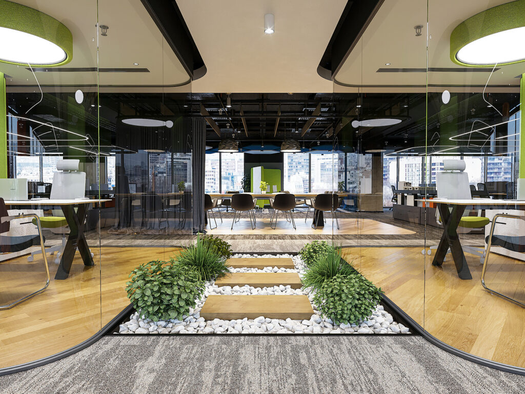
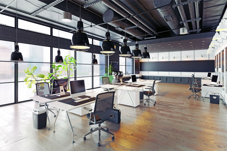
The choice of colors in workspaces can have a significant impact on employee productivity and focus. Vibrant and stimulating colors like yellow and orange can promote creativity and energize the workspace. Cool tones such as blue and green are known to enhance concentration and a sense of tranquility. It’s important to strike a balance between creating an engaging environment and avoiding overwhelming or distracting color schemes. Collaborating with a commercial interior design company ensures that the colors chosen in workspaces promote productivity and well-being.
Creating Harmonious and Relaxing Spaces
Certain colors are known for their ability to create harmonious and relaxing spaces. Cool tones like blue and green are associated with nature and can instill a sense of tranquility. These colors are often used in wellness areas, break rooms, and spaces intended for relaxation and rejuvenation. Soft pastels and neutral tones can also contribute to a calming ambiance. A commercial interior design company can utilize the psychology of colors to create visually appealing spaces that promote a sense of calm and well-being.
Our space planning services in commercial interior design focus on optimizing the functionality and efficiency of your workspace, ensuring a seamless and well-utilized layout.
Considerations for Different Industries
Different industries have unique requirements when it comes to color choices. For example, vibrant and bold colors may be suitable for creative industries, while more subdued and elegant color palettes may be appropriate for professional services. Understanding the industry-specific associations of colors allows a commercial interior design company to create spaces that align with the brand and target audience.
Our 3D visualization services in commercial interior design bring your vision to life, providing realistic and immersive representations of your space before construction begins.
Conclusion
The psychology of colors in commercial interior design goes beyond aesthetics. It has the power to influence emotions, perceptions, and behaviors within a space. By partnering with a commercial interior design company, businesses can tap into this power and create impactful environments that align with their brand’s identity and purpose. Thoughtful color selection can create welcoming reception areas, enhance productivity in workspaces, and promote relaxation in wellness spaces. Understanding the psychology of colors is key to creating visually appealing and emotionally engaging spaces that leave a lasting impression on visitors and employees alike.