In the realm of Office Design, the power of color transcends mere aesthetics—it influences mood, productivity, and overall well-being. The strategic use of color is a design tool that can elevate your office space from ordinary to extraordinary. Let’s embark on a journey of understanding the impact and nuances of mastering office aesthetics through color harmony.
The Psychology Behind Colors
Each color has a psychological impact, evoking specific emotions and reactions. For instance:
Blue: Calming and promotes focus.
Green: Enhances a sense of balance and tranquility.
Red: Energizing and stimulates creativity.
Yellow: Uplifting and fosters optimism.
Understanding the psychological effects of colors is crucial in creating an office environment that aligns with the desired atmosphere and Work Culture.
Color Harmony in Office Design
Monochromatic Schemes: Utilizing variations of a single color for a sleek and sophisticated look.
Analogous Schemes: Blending neighboring colors on the color wheel for a harmonious and cohesive feel.
Complementary Schemes: Pairing contrasting colors for a vibrant and dynamic visual impact.
Achieving color harmony involves a thoughtful selection of hues that resonate with your brand identity and the intended ambiance.
Boosting Productivity
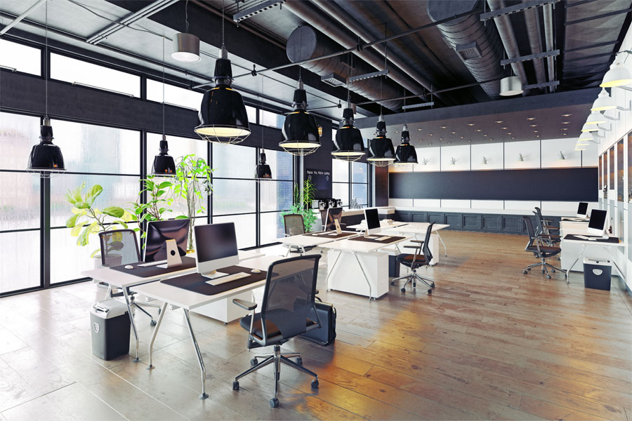
The right color scheme can significantly impact productivity. For a high-energy environment, consider incorporating stimulating colors like reds and oranges. Conversely, cooler tones like blues and greens can promote a calm and focused atmosphere.
Fostering Collaboration and Creativity
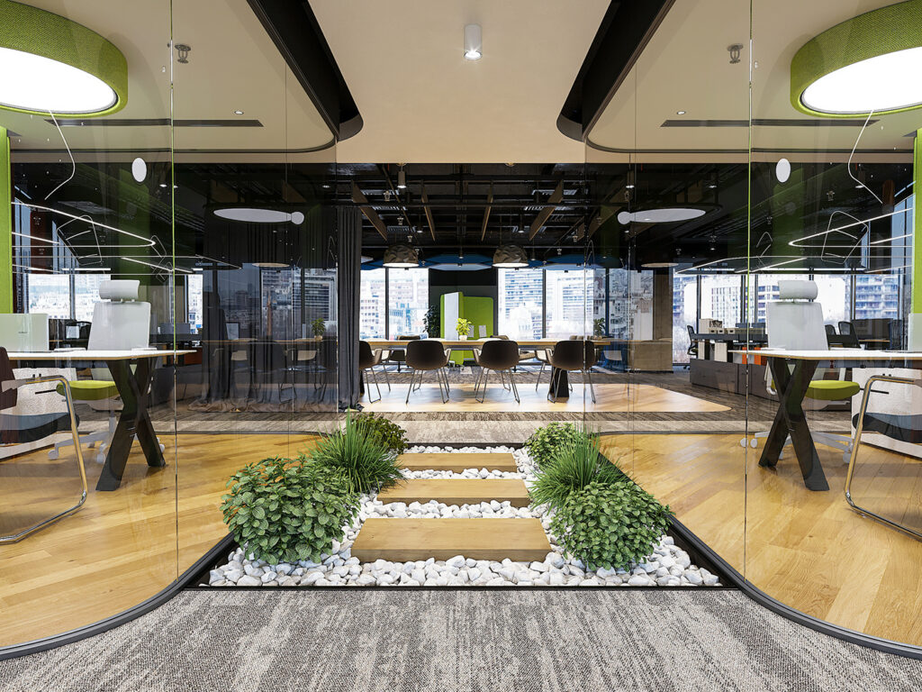
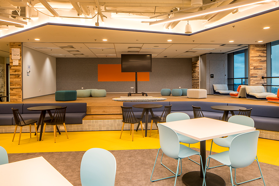
Creativity flourishes in an environment that encourages collaboration. Opting for a blend of vibrant and neutral tones can strike the perfect balance. Creative spaces can benefit from pops of bold colors to inspire fresh ideas and innovation.
Reflecting Brand Identity
Your office is a visual representation of your brand. Aligning the color palette with your brand’s identity reinforces brand recognition and creates a cohesive and professional atmosphere.
Consideration of Space and Lighting
The size of the office space and the amount of natural light it receives are essential factors. Lighter colors can make smaller spaces feel more expansive, while darker tones can add warmth and coziness. Maximizing natural light enhances the overall impact of your chosen color scheme.
Adapting to Functionality
Different areas of the office serve distinct functions. Tailor your color choices to the specific needs of each space. For instance, calming colors in break areas and energizing tones in collaborative spaces.
Evolving with Trends
Office design trends evolve, and so should your color choices. Stay attuned to industry trends to keep your workspace visually contemporary and appealing.
In Conclusion
Mastering office aesthetics through color harmony is an art and a science. It requires a keen understanding of your brand, your employees, and the atmosphere you wish to create. Whether you’re revitalizing an existing space or designing a new one, the impact of color cannot be overstated.
Embrace the power of color in your Office Design Journey, and witness the transformative effects on employee morale, creativity, and overall productivity. Unveil the full potential of your workspace by mastering the art of color harmony.