Introduction
Colors aren’t just decorative—they’re powerful tools that influence mood, creativity, and focus in the workplace. In commercial interiors, color psychology has become a game-changer, helping companies design spaces that inspire employees, improve well-being, and maximize productivity.
Why Color Psychology Matters in Office Design
- Boosts Productivity: Specific colors stimulate energy and focus.
- Enhances Creativity: Bold, warm tones encourage brainstorming and innovation.
- Supports Well-Being: Calming hues reduce stress and create balance.
- Defines Brand Identity: Colors communicate values and reinforce company culture.
The Psychology of Colors in Commercial Interiors
- Blue: The Focus Enhancer
- Promotes calm, focus, and logical thinking.
- Ideal for finance, IT, and research-based teams.
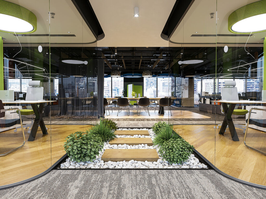
- Green: The Balance & Refresh Color
- Reduces eye strain and boosts mental clarity.
- Works well in breakout zones and open-plan areas.
- Yellow: The Creativity Booster
- Inspires optimism and innovative thinking.
- Perfect for marketing or design studios.
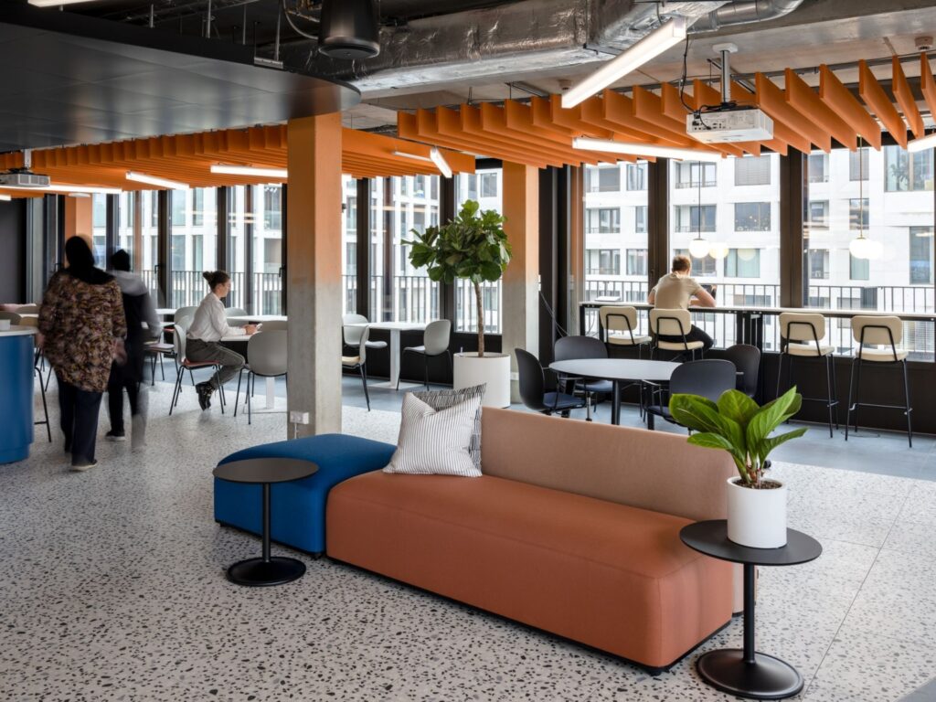
- Red: The Energy Stimulator
- Evokes passion, urgency, and physical activity.
- Best used sparingly in gyms or collaboration corners.
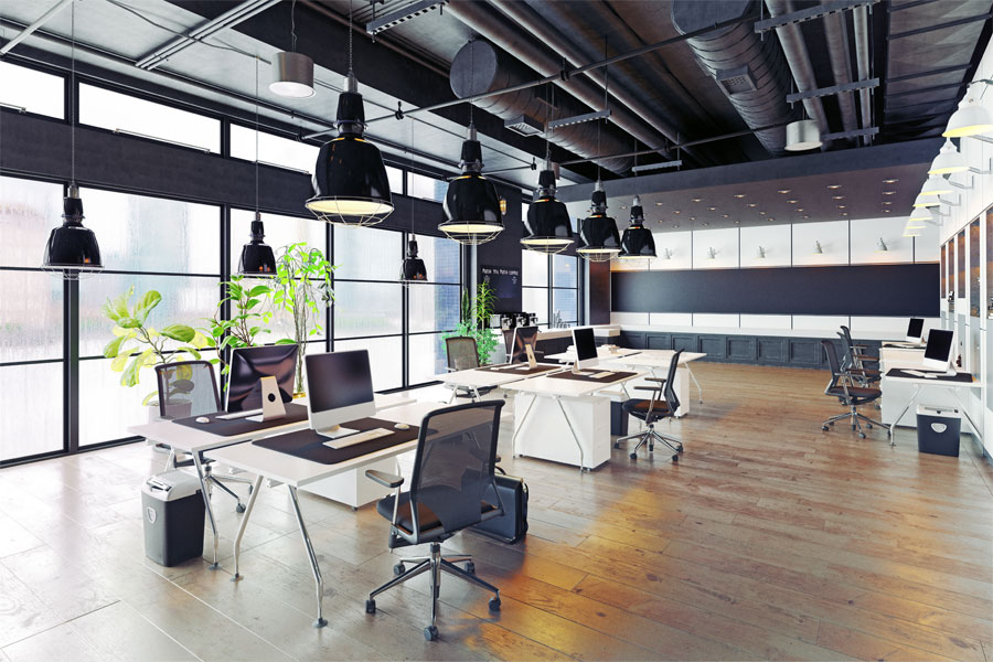
- White & Neutrals: The Canvas
- Create spaciousness, simplicity, and modern appeal.
- Ideal as base colors complemented by vibrant accents.
- Purple: The Luxury & Imagination Hue
- Symbolizes creativity, sophistication, and vision.
- Great for leadership rooms or executive lounges.
Practical Tips for Using Colors in Offices
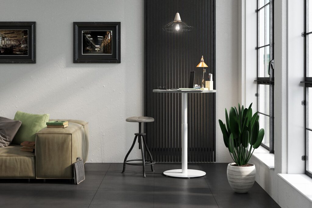
- Use accent walls or furniture highlights instead of overloading with bold colors.
- Pair neutral backdrops with vibrant accessories for balance.
- Introduce biophilic greens through plants to soften intense colors.
- Align with brand colors for a consistent company identity.
Case Example
A Bengaluru coworking space redesigned its interiors using yellow brainstorming pods, green relaxation zones, and blue focus cabins. Result:
- 30% higher reported employee creativity
- Reduced fatigue during long workdays
Trends in 2025 for Color Psychology
- Dynamic Lighting + Colors: LED lighting that shifts colors throughout the day.
- Biophilic Palettes: Earthy browns, forest greens, and sky blues.
- Color-Zoned Offices: Different colors assigned to specific activity zones.
Conclusion
When applied thoughtfully, color psychology transforms commercial interiors into inspiring, balanced, and productive environments. It’s not about painting walls randomly—it’s about aligning design with the emotions you want to foster.
👉 At AirBrick Infra, we craft color strategies that elevate workspaces, blending science with design for maximum impact.